Our clients are ridiculously good looking.
And when you’re lookinG good, PEOPLE notice.
By Service
- Creative
- E-Commerce
- Education
- Engineering
- Entertainment
- Event
- Fashion
- Food and Beverage
- Healthcare
- Insurance
- Interior Design
- Law
- Legacy
- Library
- Marketing
- Municipal
- Music Industry
- Non-Profit
- Parenting
- Publishing
- Real Estate
- Restaurant/Catering
- Social Media
- Spirituality
- Subscription Box
- Technology
- Trade/Service
- Wedding
- Wellness
BY INDUSTRY

Franciscan Children’s Hospital
Studio Eighty Seven works directly with members of Franciscan Children’s Hospital in-house marketing team supporting all internal and external marketing initiatives—from flyers, website graphics, signage, and branding support—Studio Eighty Seven is tasked with insuring the Franciscan Children’s brand is consistent across all platforms.
Rochester Child Care Center
Rochester Child Care Center (RCCC) is a non-profit child care center that provides quality, nature-based child care at an accessible price for families in the Rochester, New Hampshire area. Studio Eighty Seven was tasked with updating their site so that it better reflected and communicated RCCC’s mission, values, and programs, and provided access to information and resources to prospective and current families. Working closely with the RCCC team, Studio Eighty Seven transitioned the site from Wordpress to SquareSpace 7.1 while defining a new visual language—including a defined color palette and typography—for the brand. Drawing inspiration from RCCC’s new exterior signage the site is bold, colorful, and easy to navigate. It also features custom icons and illustrations that break-up text heavy pages, and visually communicate a nurturing and engaging child care environment. Better still, behind the scenes, the site is easier for the RCCC team to update in-house cutting website maintenance costs.

Northborough Free Library
The Northborough Free Library is the premier public library in its area, not only providing typical library services—book lending and technology access—but setting itself apart with consistent, exceptional customer service, and a commitment to offering community spaces and services that are safe, inclusive, and accessible to all who wish to learn and discover. The conservative, elegant new look leads with an air of discovery. While a library search used to consist of flipping through a card catalog, today it is more typically typing into an internet search bar. Synonymous with this new approach to search is the ubiquitous magnifying glass, which represents the first “O” in “Northborough,” while the familiar visual representation of a book stands in for the “B.” A playful monogram introduces the community to “NOBO” as a shorthand for Northborough. The visual identity also includes a wordmark, and color schemes specific to the children’s and teen libraries.
Middletown Public Library
Middletown Public Library is welcoming, friendly, and reliable. An entity you can rely on to help you explore, discover, and learn. They’re professional and knowledgeable in a convivial manner. The new logo is representative of Middletown’s geography, and highlights a connection to the local schools and education. The modern illustration depicts pages of a book transforming into waves crashing to shore. The illustration symbolizes transformation, and how what’s found inside a book, or library can transform us.


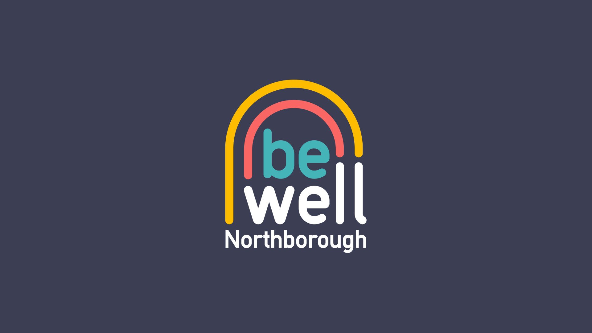
Be Well Northborough
Be Well Northborough is a health and wellness initiative bringing together several Town organizations and communities under one umbrella to promote healthy choices and resources in a post Covid-19 era. Cohesive and consistent branding designed by Studio Eighty Seven is helping bring legitimacy to this new campaign.


The ForeFront Project
The Forefront Project provides accessible pro-bono legal services to reproductive rights, health, and justice organizations. The Forefront Project strives to serve their clients with utmost professionalism and is invested—on the front lines—in their advocacy work. A true ally to the organizations they serve, the brand is mission-driven, a trusted partner, and down-to-earth. The branding emphasizes boldness, and uses typography to extenuate being on the front lines of social justice.


Wilson Wolfe Real Estate
In a nod to Wilson Wolfe’s 40+ year legacy, our new visual identity highlights a howling wolf and the brand’s iconic yellow. The sitting wolf creates the final arm of a new “W” monogram. Smart, easy to understand, and elegant, the look is approachable and honors the good-natured appeal of Wilson Wolfe. Studio Eighty Seven led the redesign of the new-and-improved Wilson Wolfe website, and assists the internal marketing team with all brand touch-points including direct mail, listing marketing efforts, signage, and social media.